How is it May already? So hard to believe we are almost half way through the year, and it sure is flying by with all the big changes which are taking place for us!
The renovation of our new studio is well on the way and we’re hoping to be moving in come June (so fingers crossed!) We are itching to get into our beautiful new space, but in the lead up to our next stage of studio life, we have just launched all our brand new branding! We are truly growing up as a company now and thought a graphic face lift was just what we deserved. Hope you are all loving the new website, blog and socials – Let us know what you think!
Today we thought we would put together a few of our top tips and ideas when it comes to styling open shelves. They can be a great way to not only add storage but create an interesting feature to any blank wall or nook.
-
Keep it simple
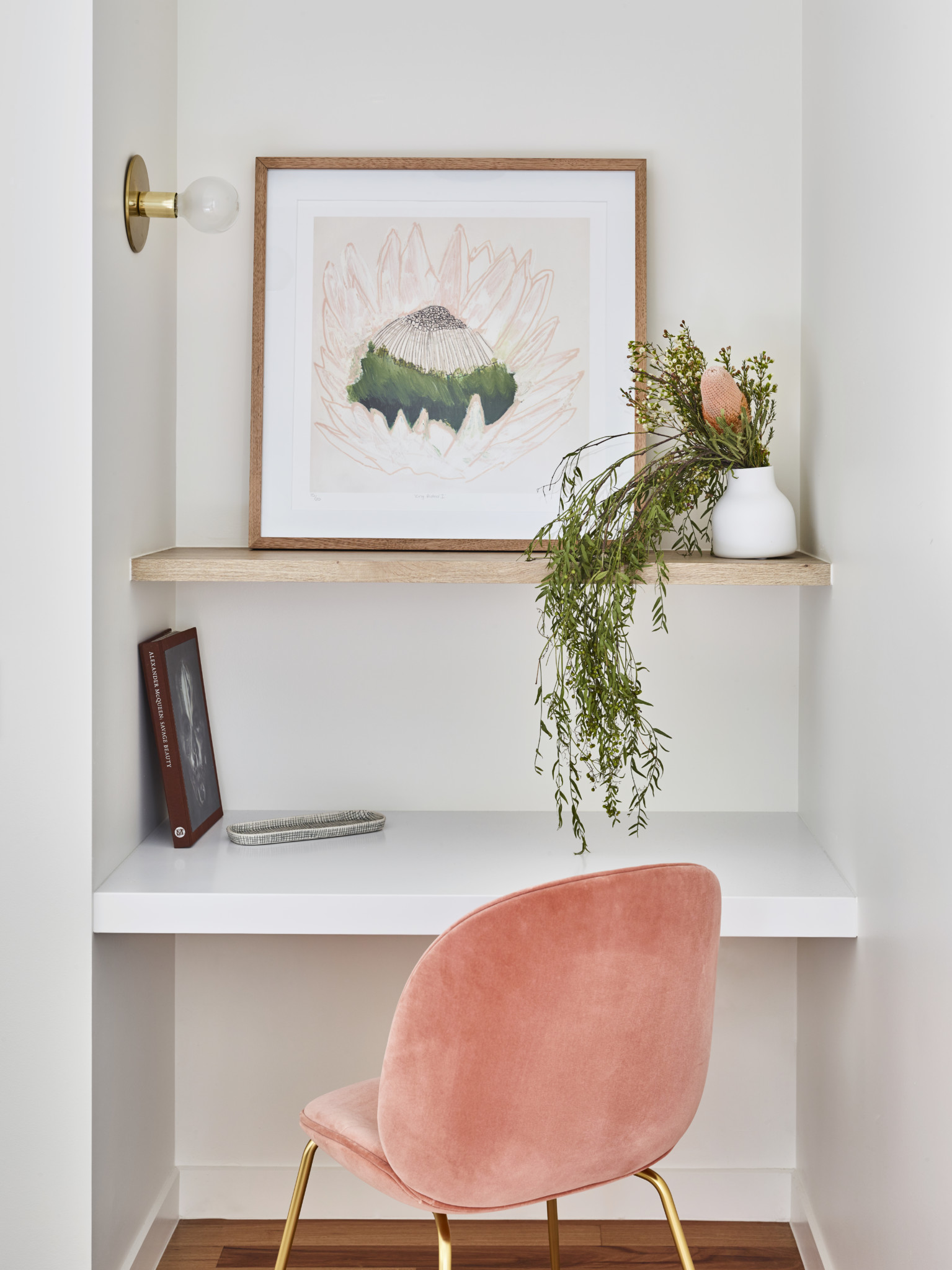
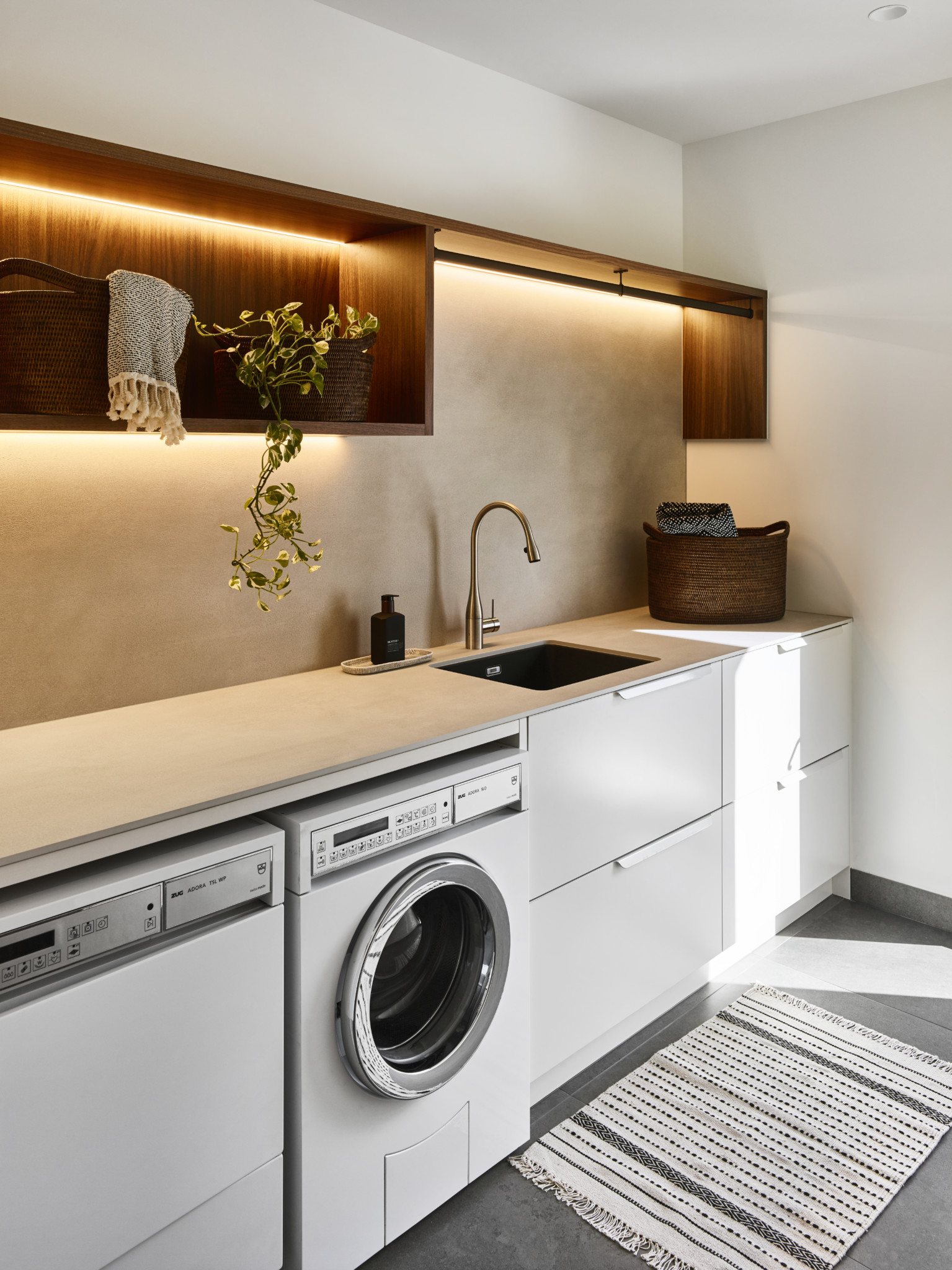
By keeping the styling to a minimum you are sure to have an open shelf that appears balanced and harmonious, allowing a combination of open space with a curated selection of feature pieces. Perhaps a leaning artwork and floral arrangement, or some baskets and potted plant life.

2. Variety and balance
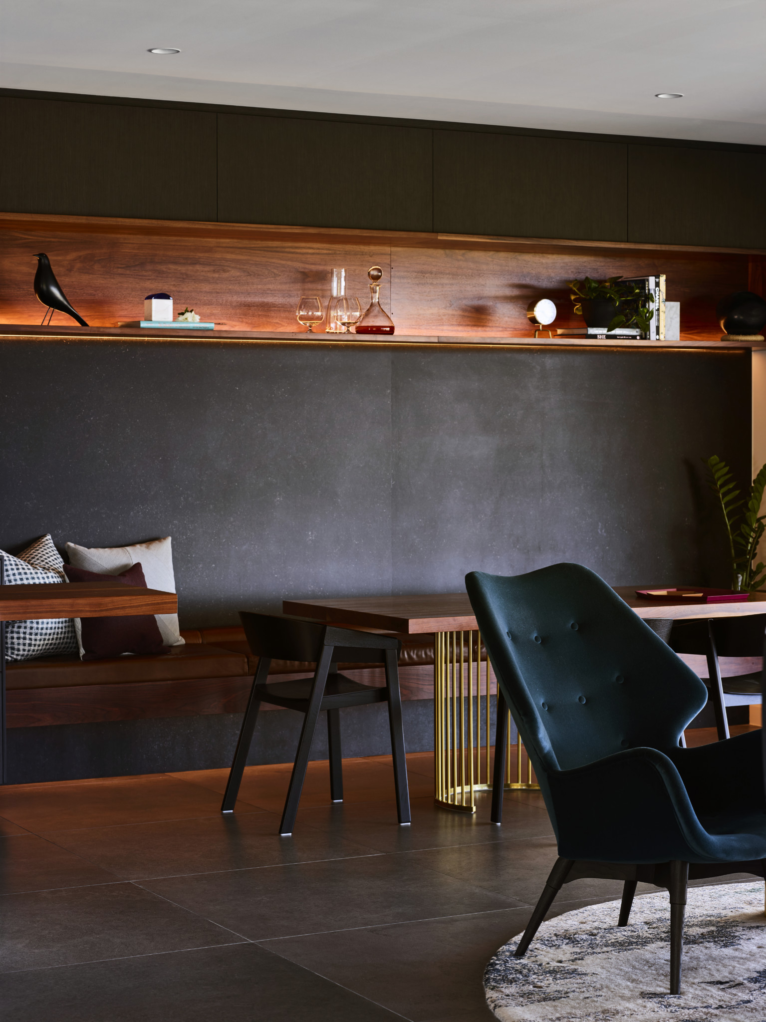
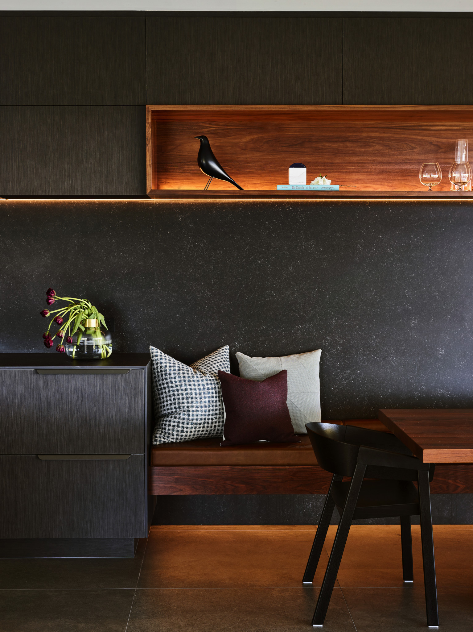
Sometimes a long floating shelf or built in nook shelving will call for more! Considering the balance of positive and negative space on your shelf, by keeping a generous about of blank space between items and off centering pieces from each other is a key technique to start. The next is to selected a variety of different pieces, from materials to shape to purpose in the space. Clocks, books, candles and plants work in almost every room in the house and are a good got too, but it can be nice to include useful items which cater to the unique uses of the space.
3. Colour palettes
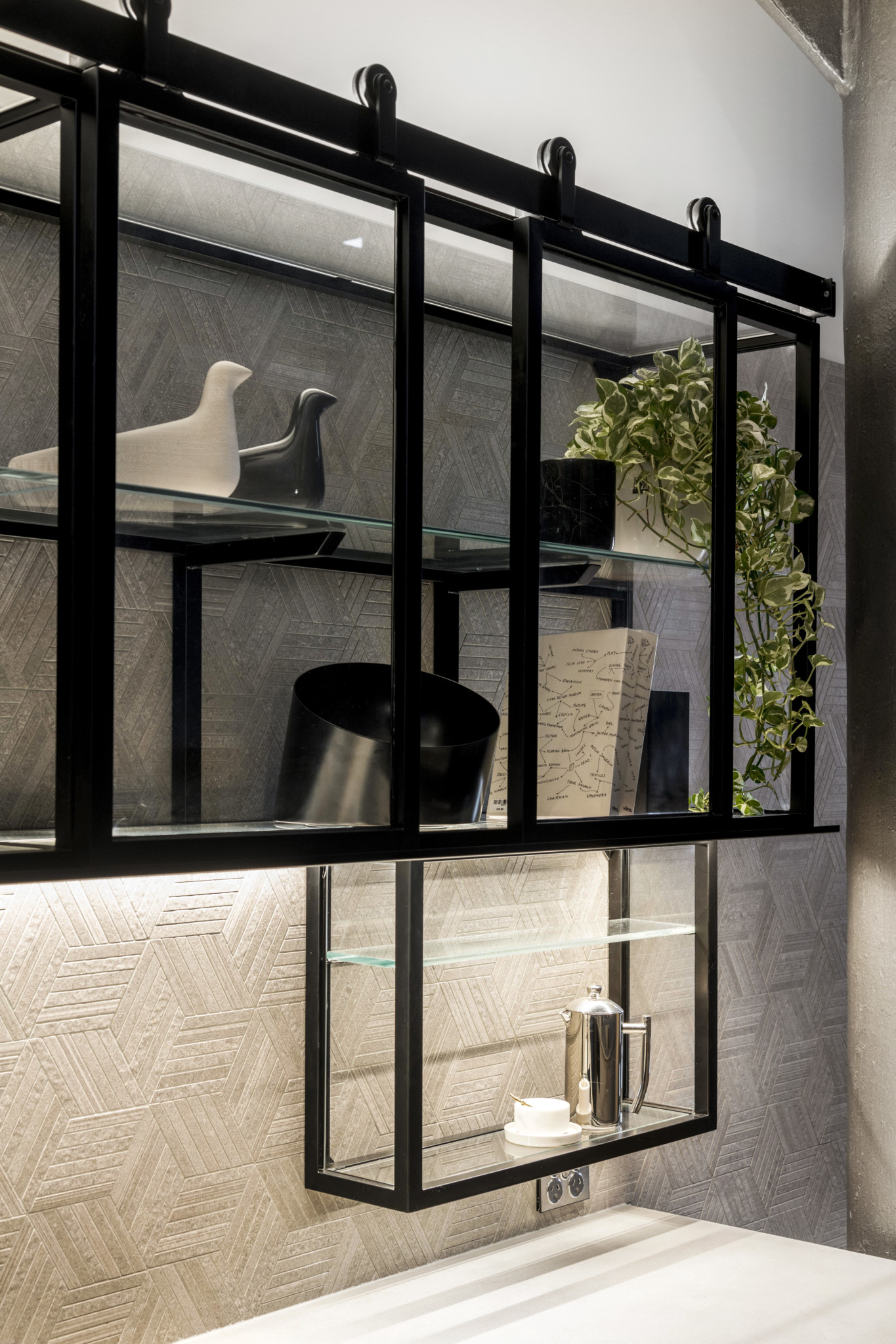
Picking a consistent colour palette for your styling items is a great way to craft an effective open shelf which sits seamlessly within the room. Pulling colours from the exisiting theme, or the shelving unit itself is a great go to if colour choices aren’t really your thing. By selecting a few monochromatic pieces in varying textures in the kitchen space above, we were able to create a full yet simple look to the floating industrial shelf feature.
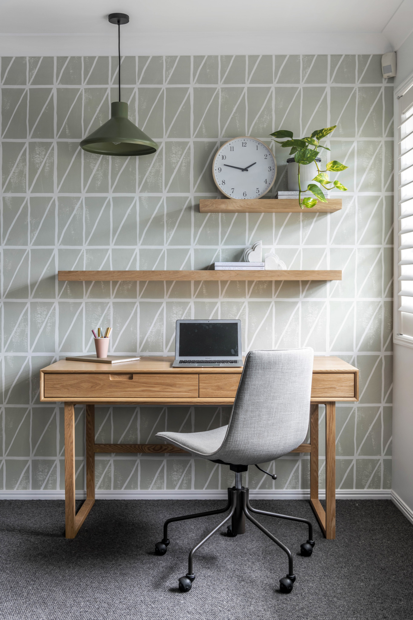
4. Avoid centering
When it comes to both the placement of the shelves on the wall and the items on the shelves themselves, off centering is the way to go! Aligning your shelves to one side of a wall rather then the center gives off a visual interest and a well considered balance to the space. The same rule applies when positioning your decorative items, keep them away from the center and allow varying heights to juxtaposition each other.
